Your cover is the first sentence of your book.
Make it one readers can’t look away from.
I’m Marcas P. O’Dea — author, publisher, and book cover designer with over four decades in the creative
industry. As the founder of Barking Dog Media USA and the publishing imprints Sepulchre Press and Rooster &
Moon Press, I don’t just design covers for books — I design them for the books I publish myself. That means I
understand what a cover needs to do at every level: catch the eye, signal the genre, honor the story, and close the
sale.
I work across the full spectrum of fiction and nonfiction: horror, gothic literary dark fiction, psychological
realism, self-help, and anthology. Every cover I design begins with one question: what does this book feel like?
The answer drives every typographic and visual decision that follows.
I’ve designed covers for bestselling author Dr. Eric Maisel (The Reenchantment of Meaning), anthologies
featuring Donald Hall, Hilary Mantel, Ursula K. Le Guin, Judy Blume, and Gloria Steinem, and multiple titles
across my own imprints. My work is in production, on shelves, and in readers’ hands.
PROJECTS

The Reenchantment of Meaning · Self-Help / Personal
Development · Dr. Eric Maisel
A sweeping sunrise-over-water image in warm rose and gold tones for a book about how to feel more alive. The bold sans-serif title treatment commands the upper two-
thirds of the cover while the subtitle and author credit anchor the lower portion in contrasting weight. Designed for a bestselling author with an established readership
— the cover needed to feel both fresh and trustworthy.
Design note: Client project. Dr. Eric Maisel is a bestselling author with 60+ published titles. This cover was developed through multiple concept rounds in collaboration with the author.

Aging: An Apprenticeship · Literary Anthology · Nan Narboe, Editor
A reclaimed wood background serves as both texture and metaphor — layered, weathered, individual planks forming a unified surface. The contributor names (Donald Hall, Hilary Mantel, Ursula K. Le Guin, Judy Blume, Gloria Steinem) are scattered across the boards in a loose, handwritten aesthetic, creating the visual impression of a life lived rather than a book designed.
The bold white title at the base grounds the arrangement.
Design note: The challenge here was hierarchy without formality — the contributors needed to feel present without any single name dominating the composition.


The Wolf Gift · The Wolves of Midwinter Anne Rice · The Wolf Gift Chronicles · Vintage Books
These two covers function as a unified diptych — distinct in imagery but locked in tonal and typographic harmony, signaling a series while allowing each volume its own atmospheric identity.
The Wolf Gift leads with pure predatory intimacy. The composition is almost uncomfortably close — a wolf’s face fills the frame to its edges, cropped so tightly that only the eyes and the coarse texture of fur register. Those amber-gold eyes carry the full weight of the cover, burning forward with unmistakable intelligence. The title typography mirrors this intensity: “ANNE RICE” commands the upper third in large, gold serif capitals, while “THE WOLF GIFT” sits centered below in matching gold — warm, dangerous, and luminous against the dark fur. The effect is confrontational and magnetic.
The Wolves of Midwinter pulls back dramatically. Where the first cover closes in, this one opens up into a cold, moonlit landscape — bare winter trees silhouetted against a deep teal sky, a single full moon centered above the treeline. The wolf is entirely absent from view, replaced by the suggestion of wolf country. The typography shifts to white, retaining the serif authority but now feeling gothic and elegiac rather than predatory. The series subtitle “The Wolf Gift Chronicles” anchors the brand relationship.
Design note: The strategic contrast between the two is the real achievement. Volume one says here is the beast. Volume two says here is the world the beast inhabits. Together they create narrative momentum — the reader moves from confrontation to immersion, from creature to mythology.

Canary in a Coalmine · Psychological Realism · Anthony Paterra
A fictionalized portrait of Veronica Lake told through a single late-night bar conversation. The cover required warmth without nostalgia — the candlelit amber tones, the subject’s guarded gaze, and the restraint of the serif typography all serve the book’s central tension: the gap between who the world sees and who survives.
Design note: The tagline ‘They loved the woman they saw. Not the woman she was.’ was placed mid-cover to feel discovered, not announced.

Listen for the Color of the Sea· Gothic Literary Dark Fiction · Henry F.
Shea
A painterly treatment inspired by Impressionism for a novel about Claude Debussy’s synesthesia. Musical notation dissolves into the wave itself — the design makes the book’s central metaphor visual before a single page is read. The luminous moonlit palette and fine art texture elevate this above standard literary fiction cover conventions.
Design note: Possibly the most conceptually ambitious cover in the portfolio. The integration of sheet music into the water required multiple compositional passes to achieve the right dissolution effect.

Living in a Box · Psychological Realism · Anthony Paterra
A neurosurgeon stands inside a transparent glass box as golden energy crackles through the walls around him — present, composed, but entirely contained. The concept cover externalizes the novel’s central tension before a word is read. The warm gold typography against cool gray creates an elegant tension that mirrors the character dynamic.
Design note: This is a concept cover in the truest sense — the image was constructed around the idea, not sourced to approximate it.
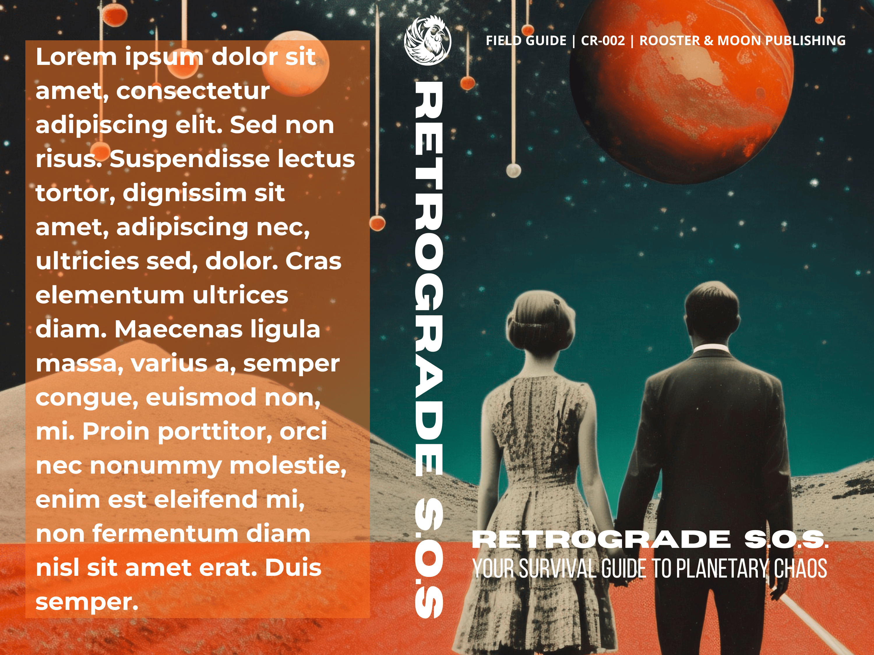
Retrograde S.O.S.: Your Survival Guide to Planetary Chaos · CR-002 · Rooster & Moon Publishing
This cover operates as a confident collision between vintage retrofuturism and contemporary design energy — a deliberately anachronistic world where mid-century figures stand on alien terrain gazing up at a cosmos that is beautiful, indifferent, and slightly threatening.
The central imagery does the heavy lifting. Two figures — a woman in a period dress, a man in a suit — stand with their backs to the viewer on what reads as a Martian or lunar landscape, facing an enormous rust-orange planet dominating the upper right quadrant. The starfield behind them pulses with teal depth. Suspended planetary orbs on fine threads drift through the composition like cosmic wind chimes. The overall effect is simultaneously nostalgic and disorienting — these very human, very grounded figures confronting something vast and uncontrollable. Which is precisely the book’s subject.
The vertical RETROGRADE S.O.S. spine treatment is a strong design choice — bold white condensed type running top to bottom creates a structural axis that divides the composition and draws the eye through the full height of the cover. The horizontal title treatment at the bottom right then anchors that vertical energy, delivering the full title with authority.
The burnt orange bar at the base unifies the Martian color palette and grounds the typography cleanly.
Design note: The lorem ipsum placeholder on the left panel signals a back cover or interior spread in development. Once real content lands there, the tonal balance between text panel and imagery will need careful calibration — the orange transparency overlay is doing good work holding that space without overwhelming the central composition.

Plummet · Gothic Literary Dark Fiction · Henry F. Shea
A man falls through a burning, cathedral-studded sky with the Golden Gate Bridge fragmenting above him. The cover operates as pure atmosphere — cinematic scale, dark
fantasy undertones, and a design sensibility closer to fine art than commercial genre. The ornate title treatment anchors the chaos without fighting it.
Design note: The bridge fragment in the upper right corner is the only grounding element — everything else is deliberate disorientation.

Job’s Comfort · Gothic Literary Dark Fiction · Henry F. Shea
A lone figure walks a rain-slicked highway toward a distant town while a massive, ghostly face emerges from the storm clouds above — watching, impassive, inescapable. The muted, painterly palette and the scale contrast between the figure and the apparition communicate dread at a landscape level. The tagline is placed directly on the road itself.
Design note: The face-in-clouds element required careful integration to feel organic to the composition rather than superimposed.

The Rules We Live By · Stories and Reflections on Unlearning Patriarchal Masculinity · Destyn A’Dante Land
The cover’s central conceit is immediately legible and conceptually precise — each title word struck through with a bold yellow brushstroke, enacting the book’s argument visually before a single page is turned. The rules are literally being crossed out. The design doesn’t illustrate the theme; it performs it.
The typography alternates between massive white sans-serif title words and smaller italic subtitle phrases nestled between them, creating a layered reading experience that rewards a second look. Small birds drift through the composition, suggesting freedom as the natural consequence of unlearning. The dark charcoal background gives everything room to breathe and hit hard simultaneously.
Design note: The yellow brushstroke is doing triple duty — visual strike-through, color accent, and textural contrast against the clean typography. Elegant economy.

The Pain Habit · Discover the Truth About Your Pain · Drew Coverdale
The mountain photograph establishes the journey metaphor immediately — recovery as ascent, the summit as destination. The dashed trail line with waypoint markers is a clever navigational device that transforms the photographic background into an active map, placing the reader as the small figure at the bottom looking upward. The flag at the summit earns its place without feeling heavy-handed.
Design note: The tonal shift from warm pink mountain peaks to deep blue lower register mirrors the emotional arc the book promises — from pain into clarity.

Brainstorm · Harnessing the Power of Productive Obsessions · Eric Maisel PhD and Ann Maisel
Clean, direct, and memorably literal. The silhouetted head with colorful cables plugging into the crown transforms abstract neuroscience into something immediately tangible and slightly playful. The white background keeps it clinical without feeling cold.
Design note: The concept does all the work here. Sometimes the most effective design is the most honest one.

Imaginary Grace · A Novel · Henry F. Shea
This cover understands restraint. The deliberately soft focus on the solitary figure walking a snow-covered path between snow-laden trees creates profound psychological distance — we cannot identify this person, cannot read their face, cannot know their destination. They exist in a liminal space between presence and disappearance, which is precisely what the tagline promises: Love doesn’t die just because you stop believing.
The bold white title typography sits in sharp contrast against that atmospheric blur, grounding the reader while the image itself drifts. Henry F. Shea’s name anchors the base in clean black — confident, unhurried.
Design note: The blur is the design. It communicates longing, memory, and emotional distance more effectively than any sharp image could have. A genuinely mature creative decision.


<CLICK IMAGE TO OPEN IN A NEW WINDOW>
FREQUENTLY ASKED QUESTIONS
Do you work with authors outside your primary genres?
Yes — while my deepest expertise is in horror, gothic literary, and dark fiction, the portfolio demonstrates genuine range across self-help,
anthology, nonfiction, and psychological realism. If you’re unsure whether your book is a fit, reach out and we’ll talk through it.
What do you need from me to get started?
A completed creative brief (provided on booking), your manuscript or a detailed synopsis, any genre comparables you admire, and your target
audience. The more clearly you can describe the feeling you want your cover to create, the better the first concepts will be.
Do you offer premade covers?
Not at this time. Every cover is custom — designed around your specific book, your genre, and your reader. That’s the only way I know how to
work.
What’s your revision process?
After reviewing your brief, I deliver your initial concepts with a written explanation of the design thinking behind each one. You choose a
direction, provide feedback, and we refine from there. Every package includes multiple revision rounds — I don’t consider a project complete
until you’re genuinely proud of the cover.
Do you require a deposit?
Yes — 50% upon project kickoff, 50% upon final file delivery. All payments are processed securely through PayPal or direct invoice.
Not sure which package is right
for your book?
Every project starts with a conversation — no obligation, no pressure. Tell me about your book and we’ll figure it out together.